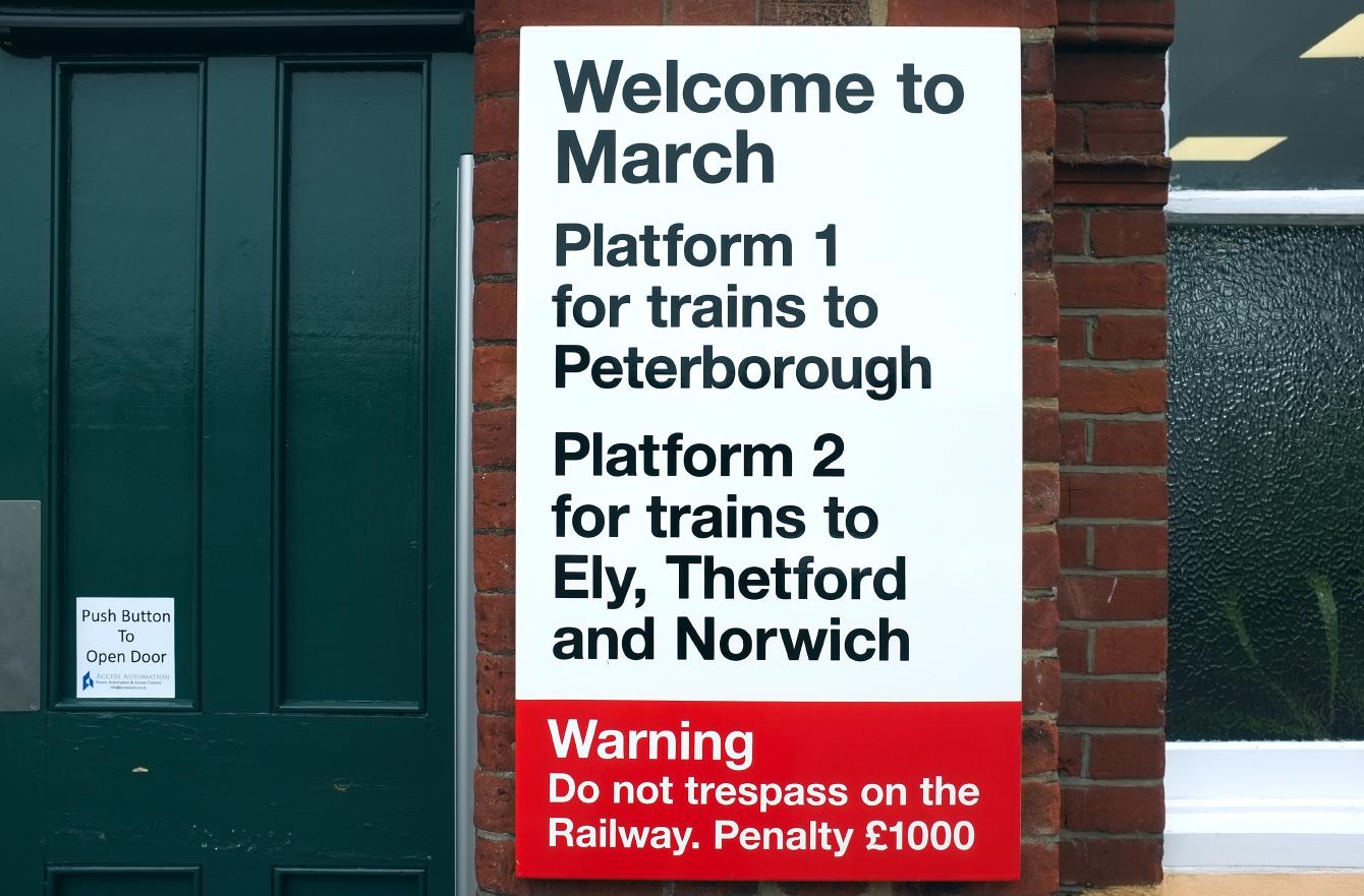
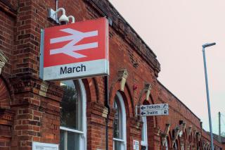
Rail Alphabet is my favourite typeface. It was everywhere on the railway network for decades; for people over a certain age, its shapes say “railway” almost as surely as a double-arrow symbol does, and as surely as “Transport” says “road”. It was so ubiquitous that one could associate that typeface with railways even if you do not know it is a distinct, single-purpose typeface - a fact I only learned in recent years thanks to Nick Job’s beautiful digitisation of the British Rail Corporate Identity Manual.
Post-privatisation, much Rail Alphabet signage was replaced, usually with worse typefaces chosen for coherence with a train operator’s brand. Rail Alphabet lives on, though precariously, at lesser-loved stations. Those remnants that have survived privatisation might be doubly endangered in the allegedly-upcoming Great British Railways rebranding, if they ever get around to doing that.
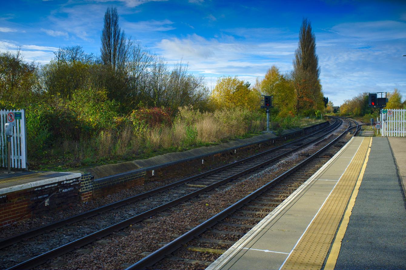
March - once a major junction station, and still has something of the feel of one despite route cuts from the 60s onwards - is one of those lesser-loved stations. It was on my mind that March was undergoing refurbishment, and that it might not keep any of its Rail Alphabet for very long. So, I paid a visit to the station in 2021 to see how much Rail Alphabet was left. As expected, nearly three decades of random branding introduced by privatisation - and the then-in-progress refurbishment - replaced or removed much of it, but there were still some lovely survivors on my visit.
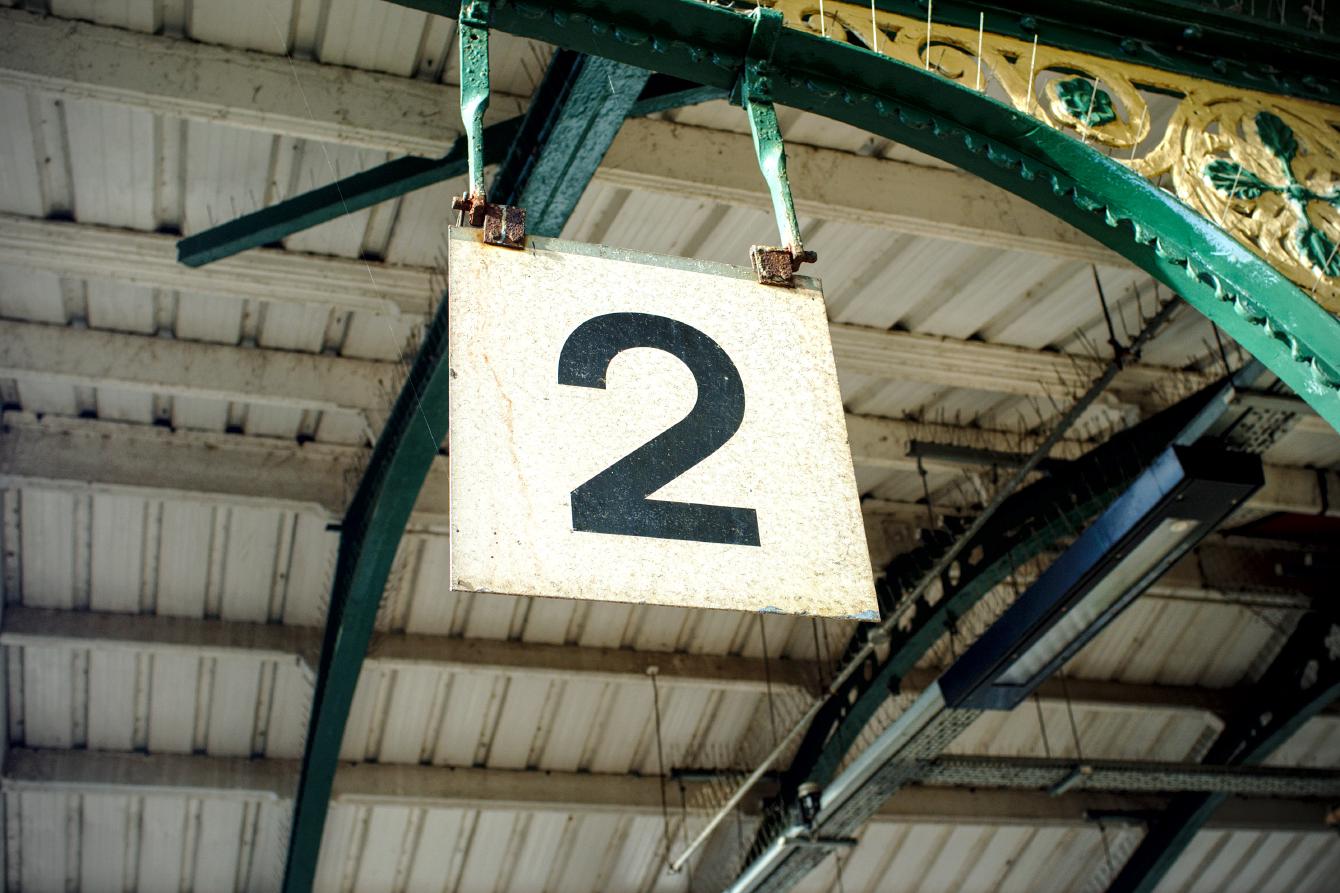
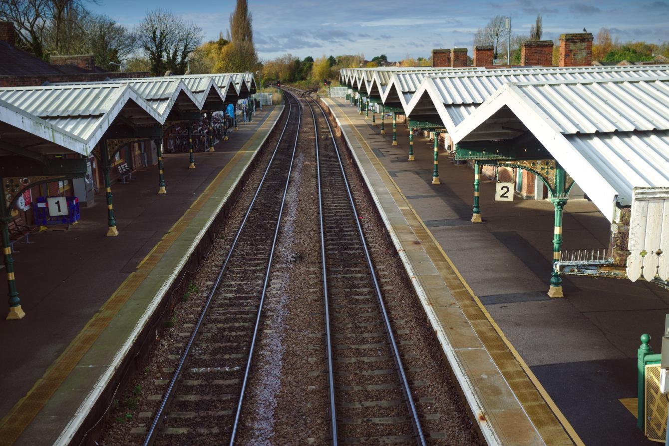
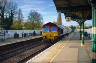
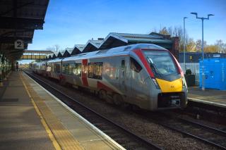
Let’s start with Rail Alphabet’s distinctive “2”, on Platform 2. Rail Alphabet is more likely to survive on platform number signs than it is anywhere else; who would think that they could improve on the clarity and function of this?
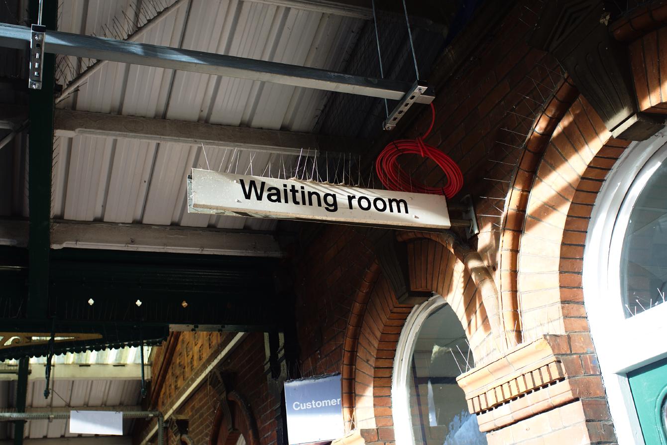
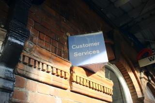
Here’s a “Waiting room” sign, which indicates a waiting room, next to a non-BR “Customer Services” sign that no longer indicates a place for customers to get service:
Compare this with the reference plank from Job’s digitisation of the Manual. It looks as though it may have had a pictogram on it at one point which has been painted over since, or perhaps it should have had a pictogram on it and never did.
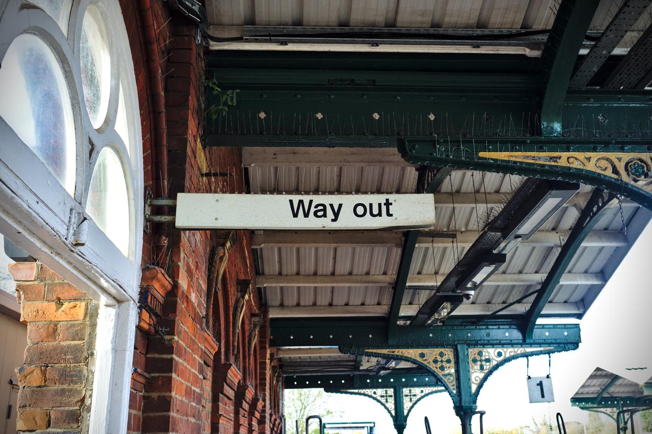
Over at the footbridge on Platform 2, there is a “Way out” sign with one of those beautiful pictograms.
This sign was likely truthful when it was installed. Over the years, this has become misleading, and rather charmingly so. Though you can get out the station via the footbridge, the nearest way out is about 15 feet to the left of this sign, along a footpath that crosses the former trackbed for the disused platforms.
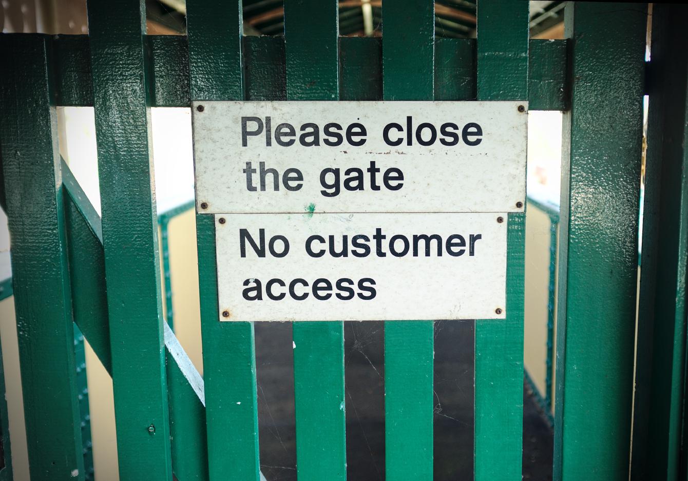
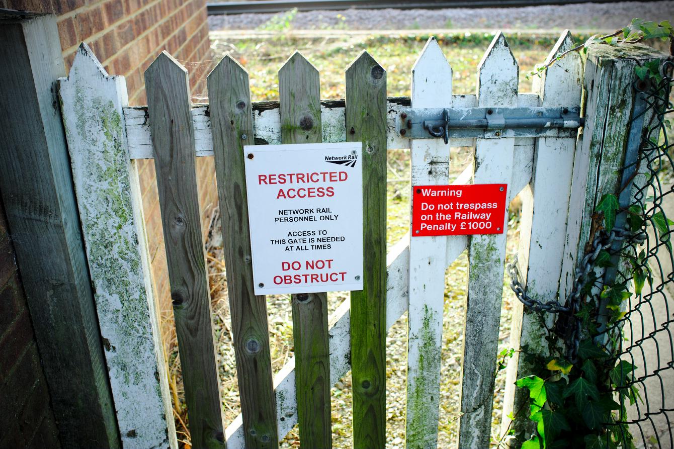
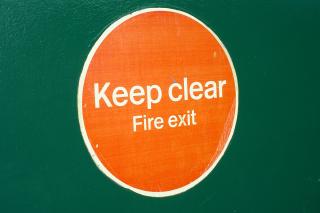
On the footbridge, is more Rail Alphabet. This gate guards the section of the footbridge that leads to the disused platforms. I did not open the gate, so I was unable to comply with its polite request to close it.
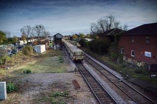
While we’re on the footbridge, take a moment to admire the view.
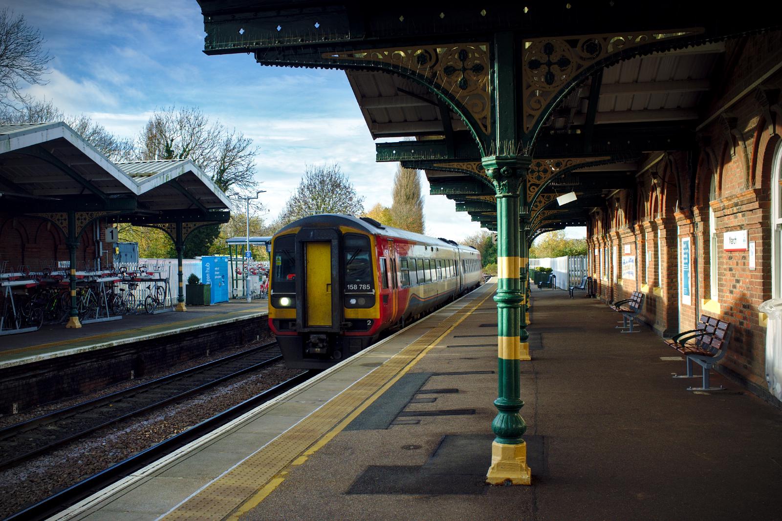
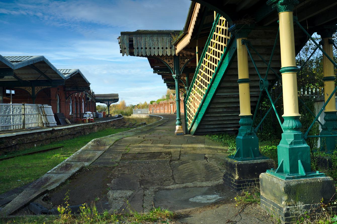
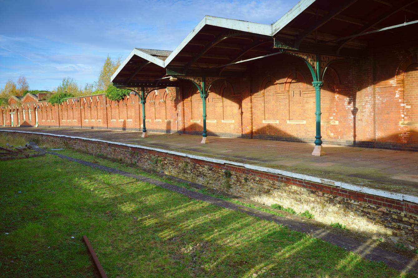
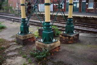
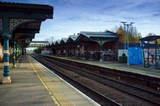
That gives us the best view yet of March’s distinctive canopies. Though over the years their coverage of the lengths of the platforms has been much reduced, they retain their distinctive zig-zag shape. This shape makes it very easy to recognise March in old photos!
Let’s head down to Platform 1, and out the entrance. The ticket office was undergoing refurbishment on my first visit, so I didn’t exit that way. Instead, I followed the “Way out” sign, which was also a gorgeous Rail Alphabet remnant, though also missing its pictogram as “Waiting room” was.
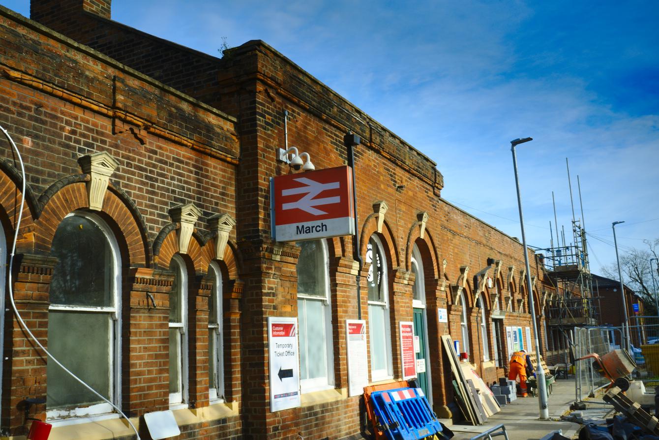
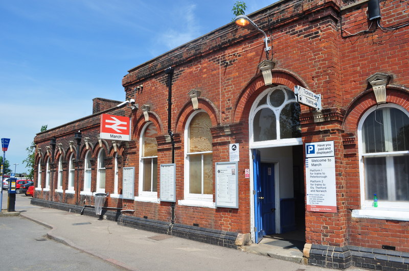
…and head outside to have a look at the outside of the station building, to find that its original double arrow station sign is still present.
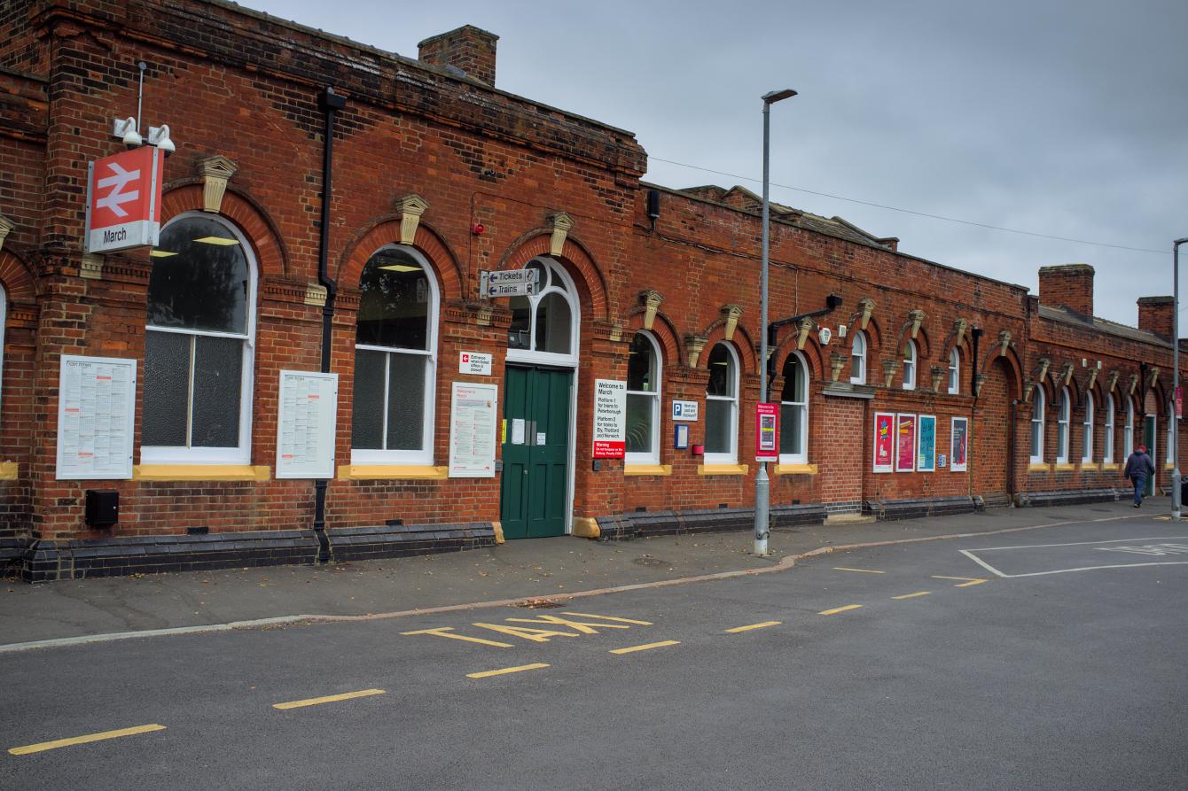
As said, my original visit here was during the refurbishment, so do pardon the clutter. On my second visit, with the construction clutter cleared, the light was much less favourable. But the Rail Alphabet “Tickets” and “Trains” returned; it looks like whoever did the refurbishment went to efforts to keep these. Nice! And these ones haven’t lost their original pictograms.
I like this information sign:
This appears on first glance to be a beautifully-preserved British Rail remnant. It isn’t. But it’s a pretty good imitation of one, and that was a nice touch added during the refurbishment. If you look at this photo from 2010 (from Ashley Dace on Geograph), you can see the sign it replaced, which has some hints of Regional Railways branding.
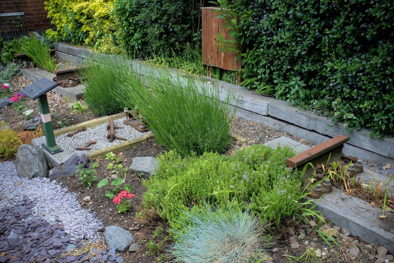
Let’s walk on, past this rather charming little garden…
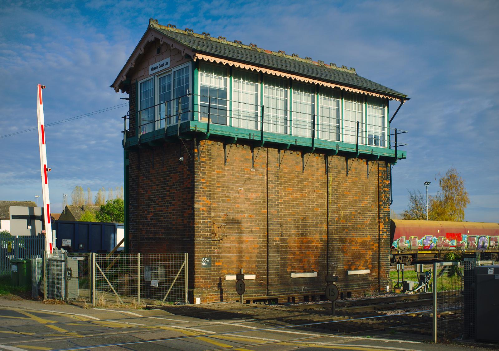
…and on to the level crossing.
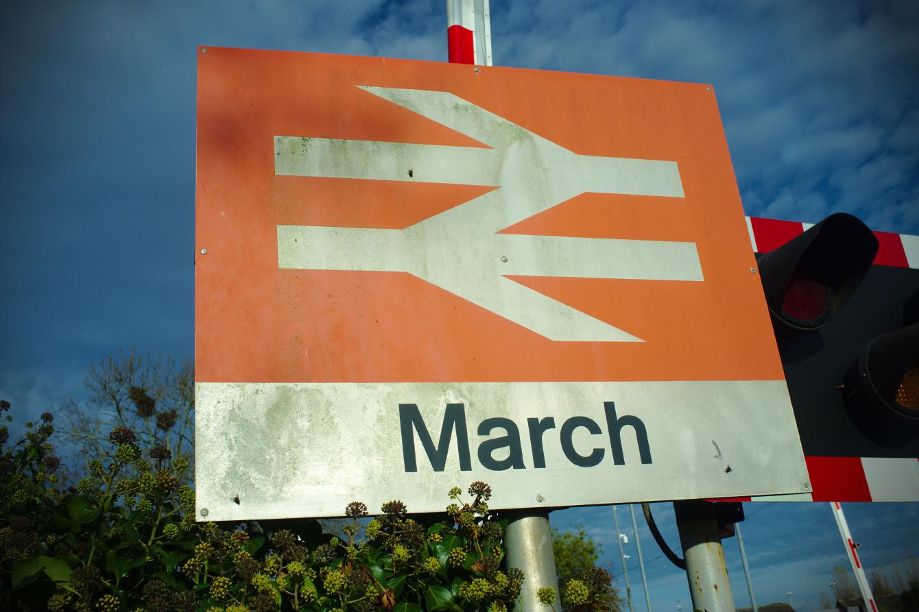
At the level crossing you will find some more Rail Alphabet, this time on the station sign next to the road which is still fully British Rail. Amazing!
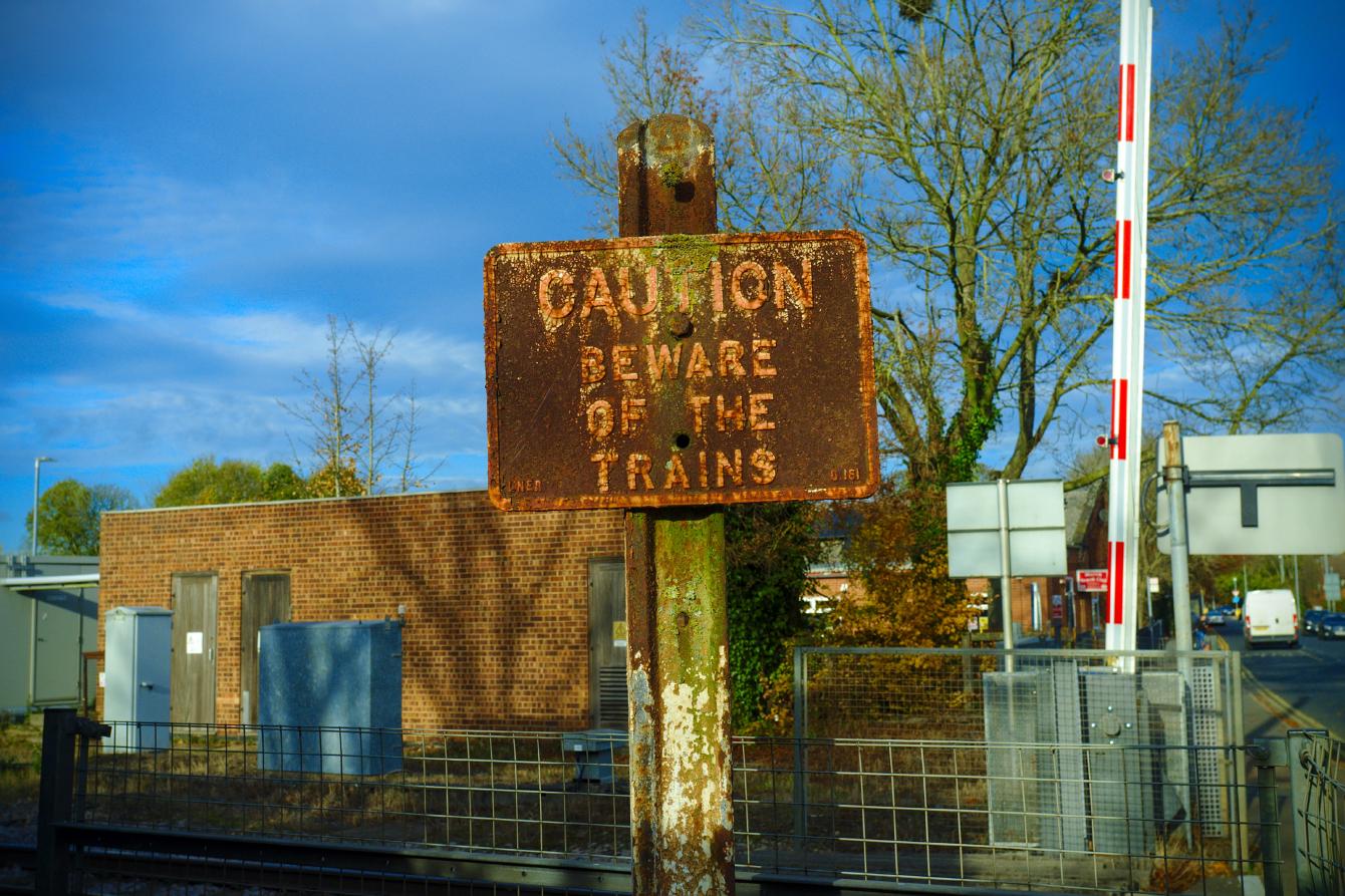
But if you keep your eyes open, you’ll find an even older sign. The “LNER” written on it dates it to 1948 at the latest. Given the country’s aversion to non-essential consumption of metal during the Second World War, we can probably guess that it predates 1939.
We can go over the level crossing, and we can examine this accidental case study in good and bad signage.
I don’t like bad signage. That might be my problem and nobody else’s. On the right is a sign that shouts at you as loud as possible with two different type sizes. The one on the right is a third of the size, tells you as much as you need to know, and does not shout at you.
So like, nostalgia. Let’s talk about that for a bit. That is what this visit was about; I like Rail Alphabet! I offer you a fear-based scale of nostalgia:
- “I like things now, but things from the past are cool and interesting”.
- “Some things from the past were better, so maybe we can learn something from them”
- “Things today are bad in every possible way and these things from the past remind me of better times”
You can look at the comments of any “how things were” video on the Internet to see all types of these. But especially type 3! Type 3 is usually accompanied by someone to blame for those things changing, and if we just got rid of those people I don’t like much we’d still live in a country of steam trains, pick and mix at Woolworth’s, jumpers for goalposts and such. (Or “an’ ting”, as the kids say these days.)
Nobody is immune to this! Not even me! Invariably, the age when things were supposed to be Better was when we were teens, an age where were were working out our place in the world, and of course it feels like a threat to our identities when those things change. Untangling that from the things that really were better back then is difficult. It’s necessary if I don’t want to be the guy angry at people less pale than me because trains are different these days. It’s better to root myself in type 1, and occasionally dabble in type 2.
All I’m getting at here is that British Rail wasn’t very good. It baffles me that anyone old enough to remember what British Rail actually was (or capable of e.g. reading the Wikipedia article, to find out what it was) would wish for its resurrection in anything like the form it had. It baffles me doubly that those people are invariably ones who like having railways, and think there should be more of them; it must require elite-athlete doublethink to hold that thought in your head along with the fact that the Beeching Axe happened under British Rail.
Still, some type 2 nostalgia here. British Rail did have an excellent and consistent system of signage (remember signage? We were talking about signage!), unlike the Network Rail one above, which looks like it was made by an very angry man with Microsoft Word.
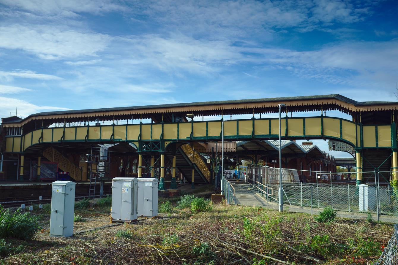
Anyway, instead of looking at those signs and thinking about the nature of nostalgia, normal people will instead their heads 90 degrees to the right and admire March’s spectacular footbridge instead.
What a view! These days the footbridge is twice as large as it needs to be, because there is no access to the disused platforms on the right of the picture. Those closed in the early 1980s, around the same time that services to Spalding were cut. Let’s go take a look!
It is a shame that these platforms are hidden behind security fencing. I had to poke my camera through it to get any photographs.
Fencing it off is a waste of a nice space if nothing else! The restoration of Folkestone Harbour gave a spectacular example of what can be done with a disused station with not much hope of seeing passenger trains again. Still, there’s plenty to look at, and the Friends of March Railway Station do a great job of stopping these unused parts being lost to decay and buddleja.
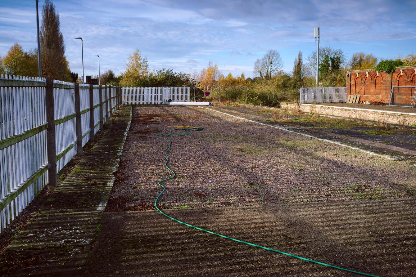
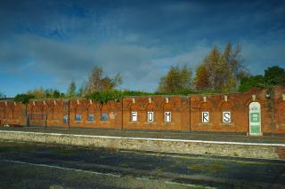
Walking back up platform 2, you will find another disused platform if you peek over the white fence. This was used for terminating trains in the past.
If you look really closely you can see a gate in the background, with a large red circle in the middle. The large red circle is an interesting detail; implies that the line running up to the gate (from the other side) may technically have been active some time after the removal of these platforms. That is not the same as any trains using it; it means only that the approaching tracks were still considered part of the rail network.
And at the end of platform 2 is evidence that platform 1 was built for much longer trains than those visiting the station today. Forking over to the right is the track to Whitemoor marshalling yards, and which also once took trains to Wisbech.
And that was my visit! It is no longer the grand junction that it was before the 1960s, nor the significant station it was until the early 1980s, and I did not expect it to be. But there’s lots to see if you keep your eyes and mind open, and it was definitely a good way to kill a couple of hours.
Links of interest
- Friends of March Railway Station have a Facebook page.
- British Rail Corporate Identity Manual, digitised by and with commentary from designer Nick Job.
